
Automotive Supplier
Aftermarket Brand Management After a Mega-Merger
A clear aftermarket brand strategy that balances corporate interest with brand equity. Hella is preserved and tangible as a standalone brand...
Read →

Approved is not implemented.
A football club has four sources of revenue. Exactly one of them can be influenced through the brand. From that calculation Lünstroth derived the brand core “movement” and translated it into logo, typeface and moving image. Approved by the managing director, the president and the supervisory board. The logo has been in use unchanged since 2008. The house typeface lasted a year.
Client
DSC Arminia Bielefeld
Industry
Professional Sport
Services
Positioning, Brand Strategy, Corporate Identity
Focus
Management & Culture
A professional club is financed from four sources: broadcasting revenue, ticketing, merchandising and sponsorship. Broadcasting revenue follows league position over several years and cannot be influenced by brand work. Ticketing depends largely on sporting strength and on the opponent. The only lever that runs through the brand is sponsorship: the more valuable the image transfer is for a partner, the higher the contracts. That is precisely where the problem lay. The club's image was encumbered — past allegations were still present in the minds of sponsors, the economic situation left doubts about the viability of a multi-year commitment, and the reputation of a yo-yo club stands for everything except stability. There was also a conflict of objectives: the values genuinely present on the fan side — stubborn, passionate, combative — are not transferable image properties for supra-regional sponsors. The question was therefore not how the club could reinvent itself, but what shared positive brand core existed at all between established fan attachment and sponsor interest.
"What can only be changed by a decision of its own survives. What requires discipline does not survive the next change at the top."
Central finding of the project
Lünstroth began not with design but with the revenue logic: which lever is reachable through the brand, and which is not? The answer narrowed the task to sponsorship and thus to the question of image transfer. Within the existing fan values sits one component that is also attractive to sponsors: dynamism. From this, together with the club's decision-making levels, the defining value of “movement” was derived — carried by the club's own history, which across more than a hundred years consists of promotions and relegations, of repeated reinvention without loss of identity, and which has its place in the middle of the city rather than at its edge. The translation into corporate identity followed the same argument. The logo was moved from an extreme landscape format into a square so that it works equally in every channel; the place name was reduced in size to make the brand accessible to supra-regional partners; movement entered through jumping dots on the i. A dedicated italic typeface was to ensure that any statement is recognisable at first glance as the club speaking. The same element was carried into moving image.

The positioning was approved — by the managing director, the president and the supervisory board. Shortly afterwards the club was relegated and the managing director was dismissed. What followed was not a counter-decision but a disappearance: changing agencies, some from the fan environment and working without fee, brought in their own typefaces and their own fan slogans. The rulebook existed and the governing bodies had signed it off — but enforcing it was nobody’s job. What remains is what cannot be changed casually: the logo has been in use unchanged since 2008. The house typeface was gone again by 2009. Both came out of the same positioning and are specified in the same manual. The difference is not quality but the threshold standing in the way of a change. A brand decision is not anchored by its approval, but by the body that enforces it.
This typeface is the Arminia. It was developed exclusively for Arminia Bielefeld, specifically for the positioning “movement”, and was meant to carry that positioning consistently across all communications.
Set in the Arminia — the typeface developed for the club
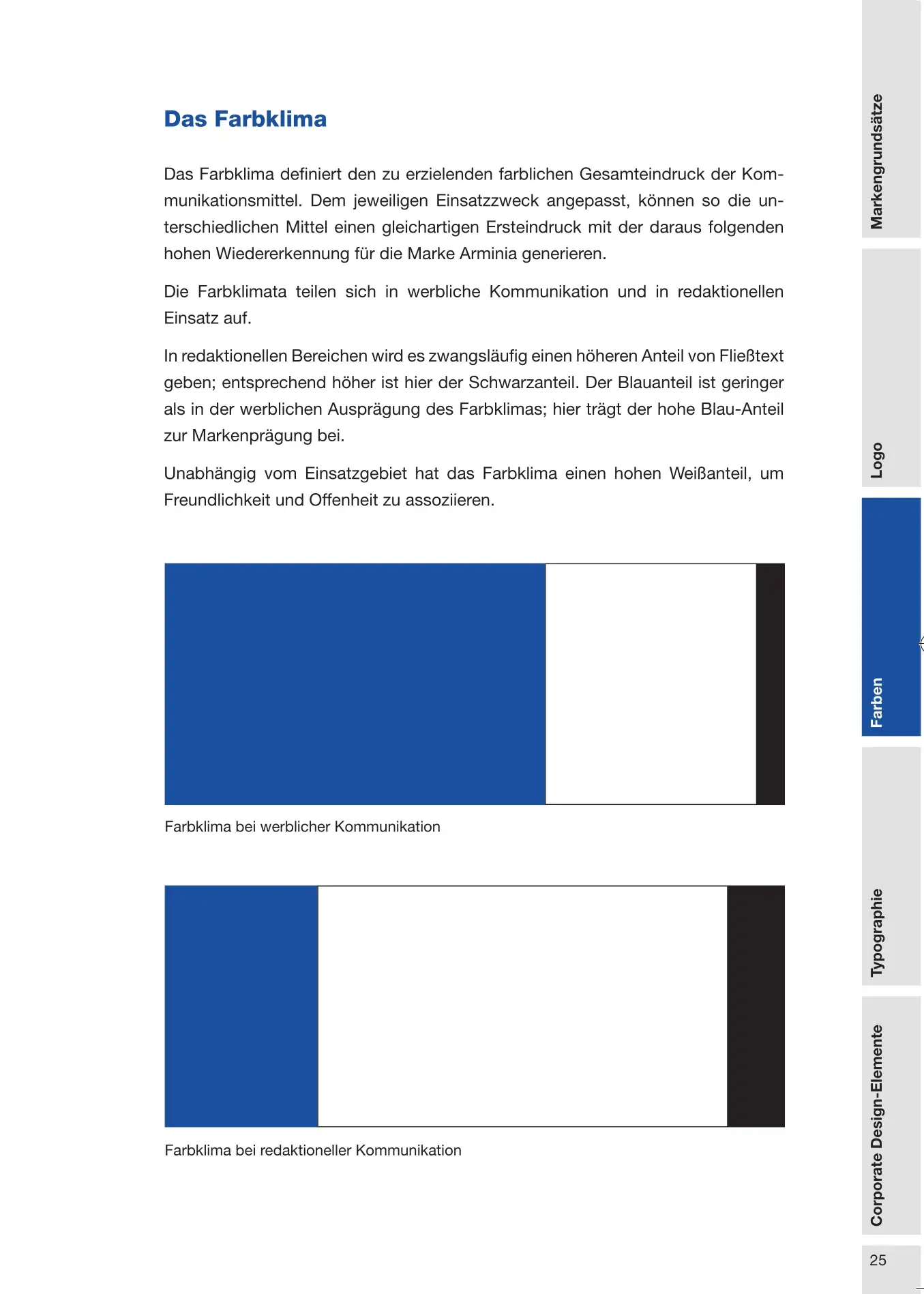
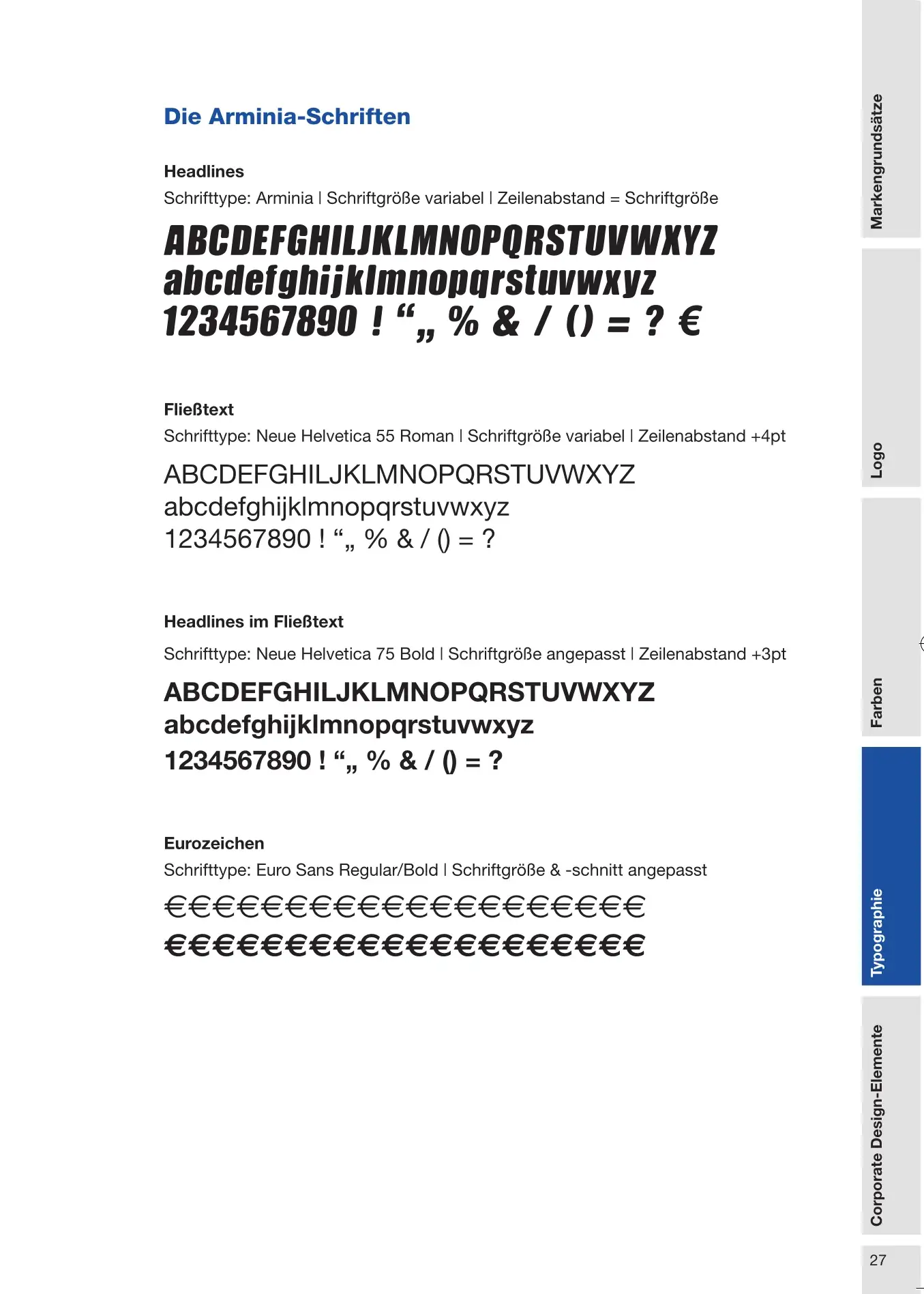
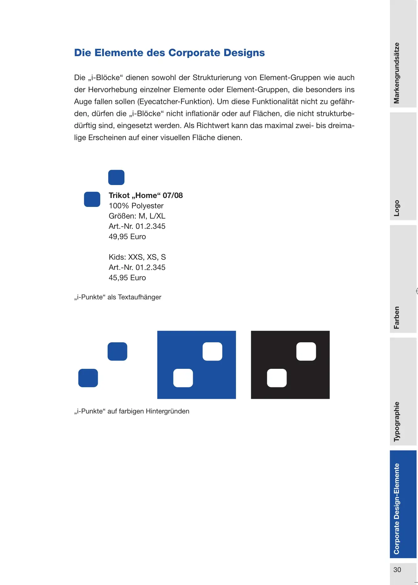
Five pages from the 2008 brand manual, three of them shown here. It is a ring binder with a thumb index — built for daily reference, not for presentation. The rulebook was complete and enforceable. What was missing was the body to enforce it.
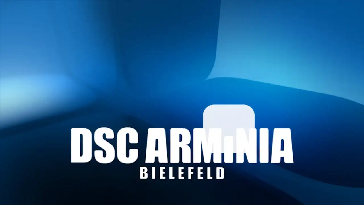
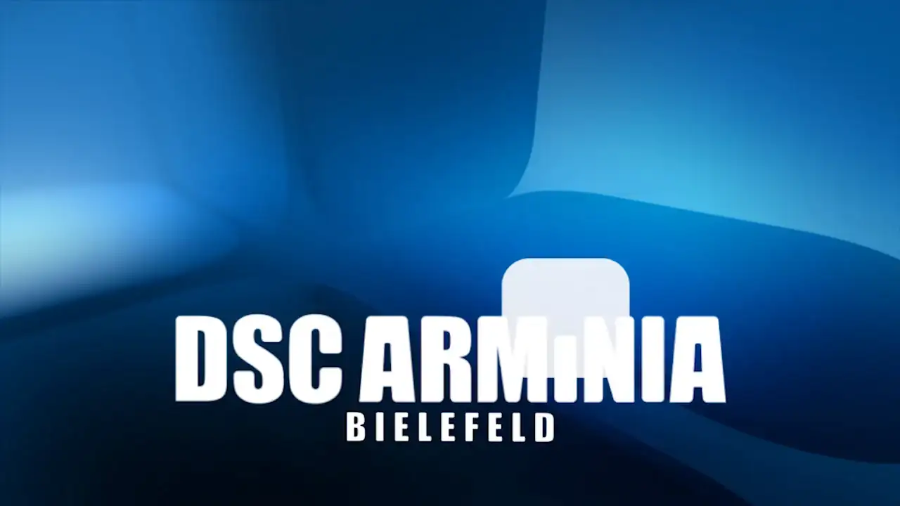
The movement element in motion: the dots on the i resolve into the wordmark. Template for the stadium videos.
Automotive Supplier

Financial Services

Construction Industry

Retail Technology / POS Systems

Automotive Supplier
Let's talk. The first conversation is free and without obligation.