


Automotive Supplier
Aftermarket Brand Management After a Mega-Merger
A clear aftermarket brand strategy that balances corporate interest with brand equity. Hella is preserved and tangible as a standalone brand...
Read →

What an own-label brand costs when price is its only argument.
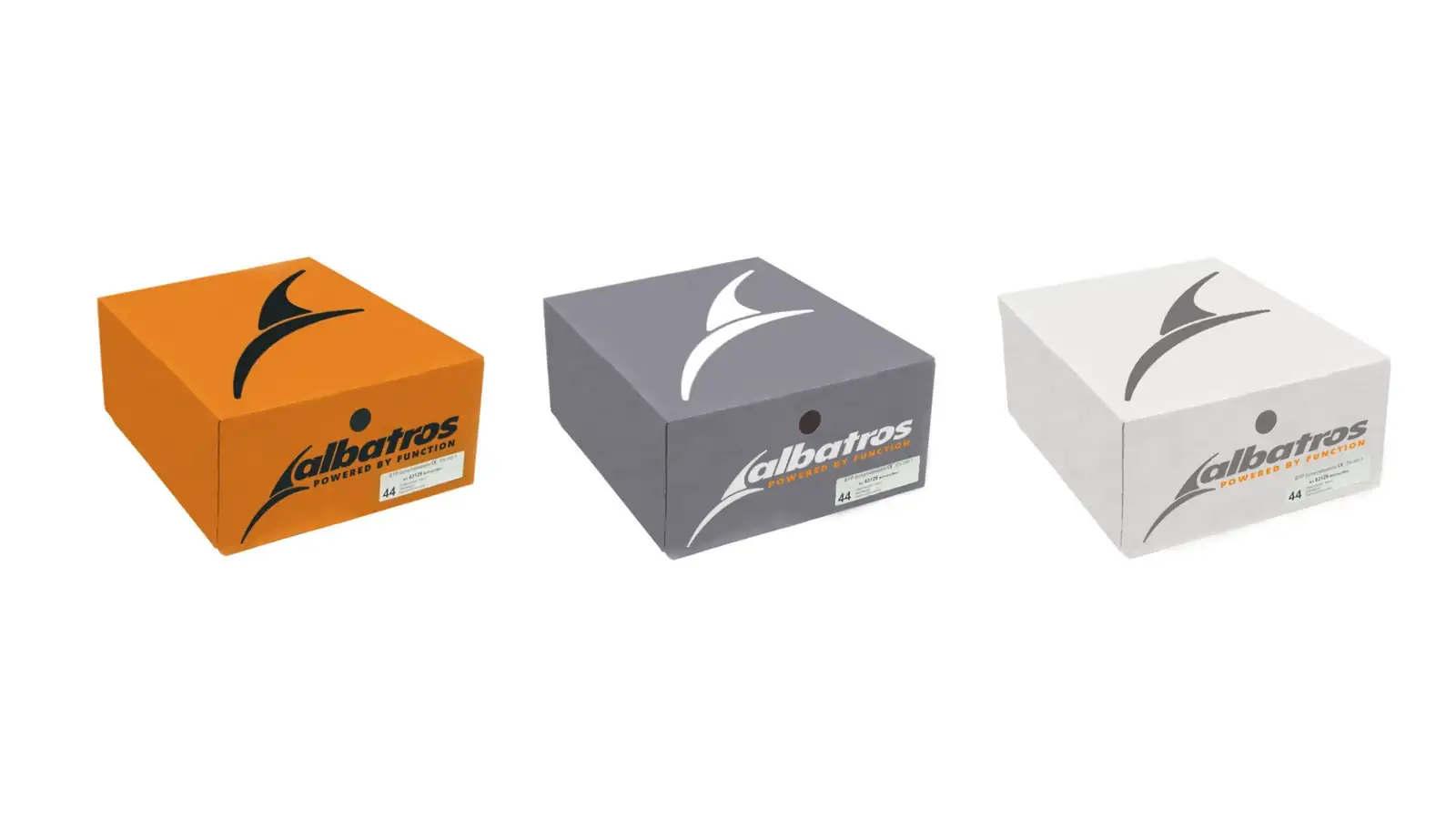
Albatros was managed like a typical own-label brand: sold on price, with correspondingly thin margins and a design that did not hold its own on the shelf. Lünstroth treated it as a brand in its own right — with a core image already contained in the name. The design system has been in use unchanged since 2005, and the range has been extended considerably since.
Client
ISM GmbH, Lippstadt
Industry
Workwear and Safety Equipment
Services
Range Brand & Own-Label, Brand Development, Corporate Identity
Focus
Identity & Presence
Own-label brands are managed as though price were their only argument. It is an assumption that confirms itself: whoever sells on price alone does not invest in distinctiveness — and whatever is not distinctive can only be sold on price. For Albatros this meant thin margins on a range that had been in the market for years. ISM GmbH of Lippstadt distributes an international manufacturer's safety footwear across Europe and carries workwear under its own brands; the difference in how the two ranges were treated was plainly visible. Market observation also showed where the actual constraint lay: it was not the word mark but the design that let the products disappear into the mass of competition — taken on its own it was barely memorable. A relaunch of the name was therefore ruled out. The brand was established, known in the trade and listed over years; replacing it would have destroyed the only asset that existed.
"An own-label brand sold only on price can only ever be sold on price. That is not a market finding — it is a decision."
Central finding of the project
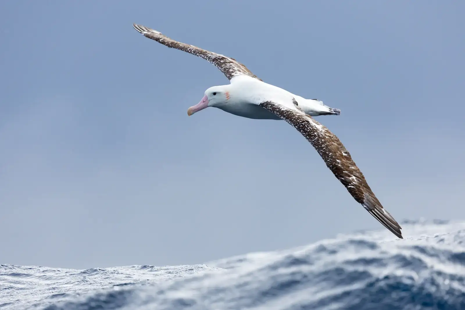
Lünstroth first asked the question that is usually skipped with own-label brands: what does this brand stand for, if not for price? The answer lay in the name itself. With a span of up to 3.5 metres, the albatross has the largest wings of any living bird species — it is the wings that define the species. That gave a core image which does not assert but denotes: it belongs to the name and requires no explanation. The designers reduced the wings to a form that carries in every media context — from label to packaging to trade fair stand — and remains recognisable at the smallest scale. This was complemented by a rulebook governing application across the entire range and all touchpoints, so that the brand is not renegotiated with every new article.
Work shoes compete on the shelf not only with each other but against the buyer’s visual habits — and those are shaped by sports footwear. In that reference world the brands carry a mark that works without the name: Adidas, Nike and Puma are recognisable by their symbol alone. Anyone who wants to connect there needs the same degree of reduction. The starting point was supplied by the wordmark itself.
1
The semantics of the name. What distinguishes the albatross is its wingspan — it allows effortless gliding over long distances. Endurance, not exertion.
2
The reduction. The wing becomes a contour that needs no explanation and holds down to the smallest scale — from label to trade fair stand.
3
The transfer. Endurance is also the product property that matters in work footwear: durability. Mark and claim say the same thing.
Photo: JJ Harrison, Gibson’s Albatross, CC BY-SA 3.0, via Wikimedia Commons. Unaltered, resized only.
Mark and design system have been in use unchanged since the 2005 relaunch — twenty-one years. The range has been extended considerably since, and that is precisely the measure that matters for an own-label brand. An own-label brand that works only on price carries no range extension: it forces the same price discussion from scratch with every additional article. A brand that stands for something carries it. The engagement ended with the project; the result has been in the market without accompanying support ever since.
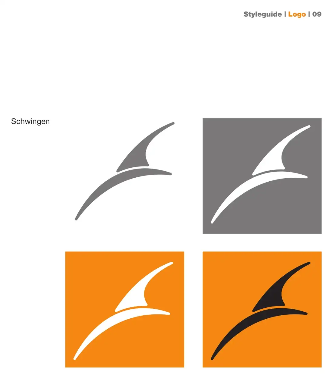
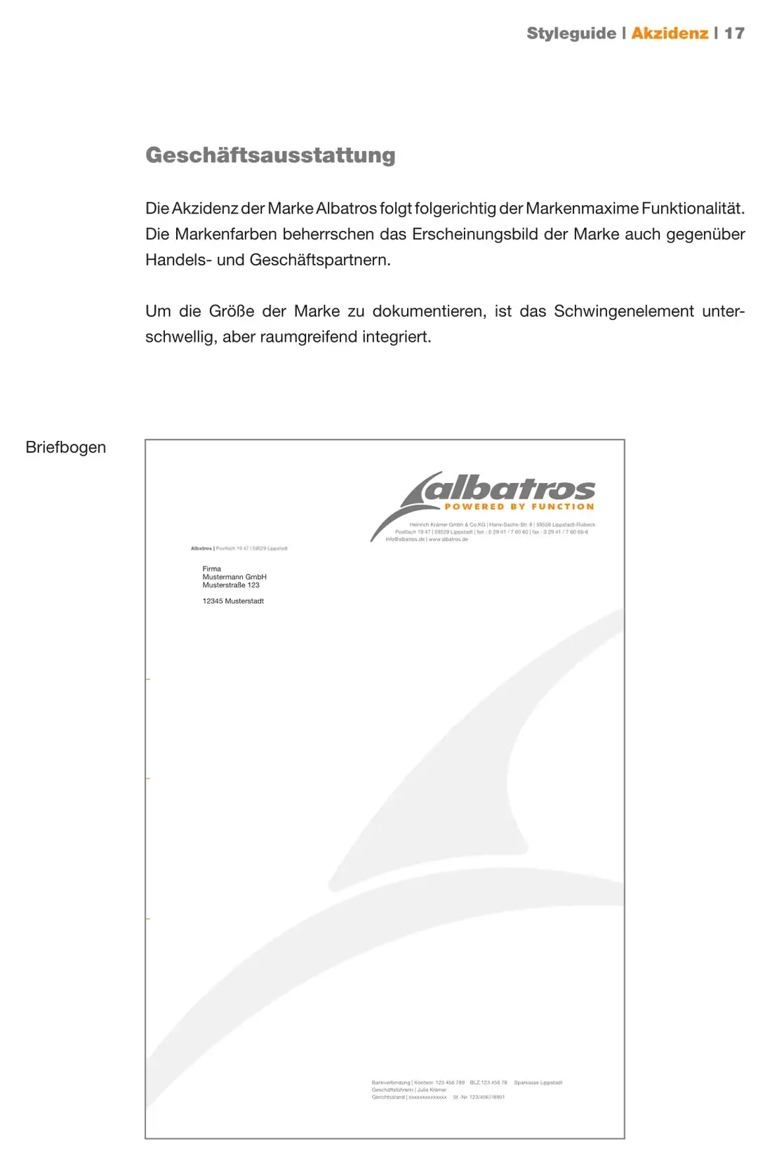
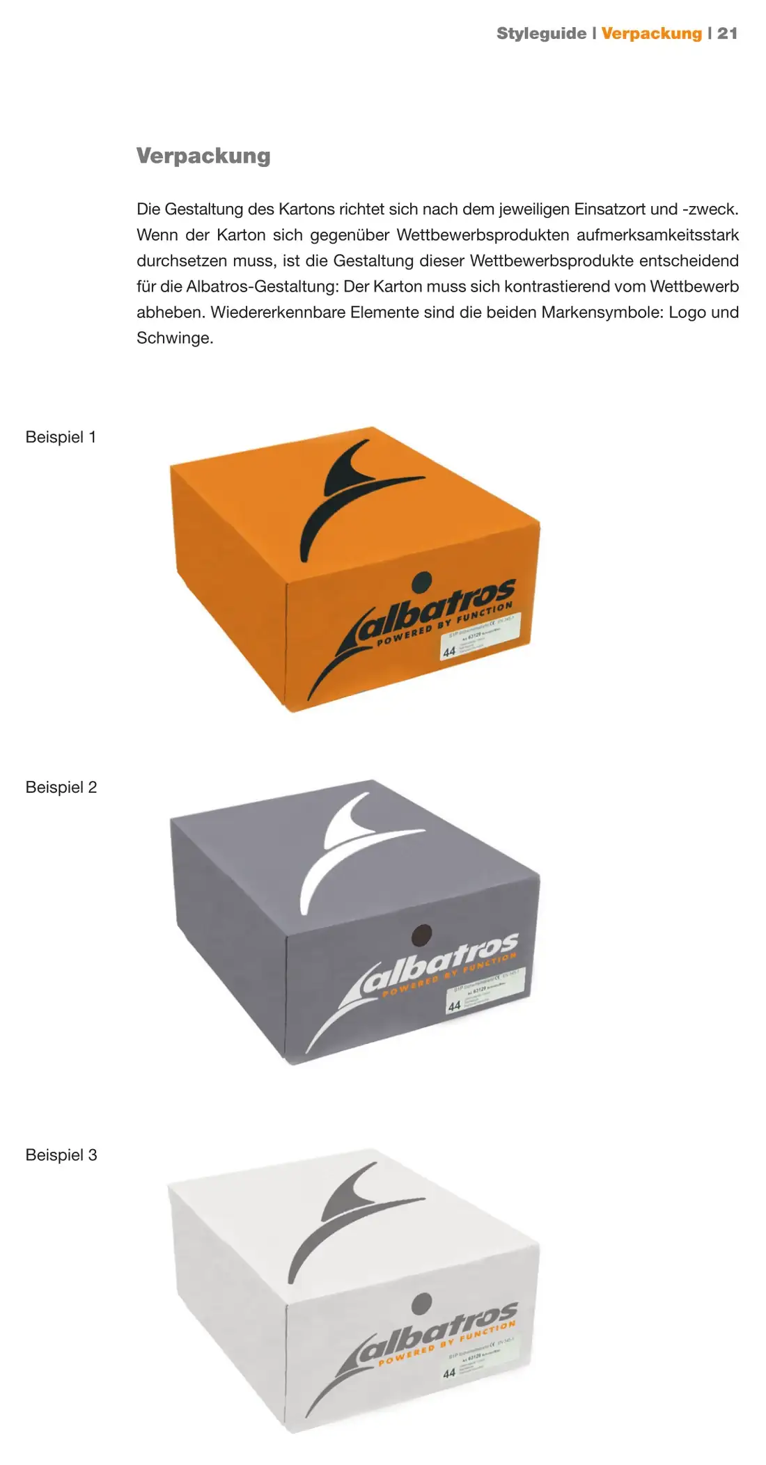
Three pages from the 2005 style guide. The wing mark is not treated as decoration but as a second brand symbol alongside the wordmark, with a function of its own: it carries images, structures surfaces and stays recognisable down to the smallest scale. The guide also states what the packaging has to respond to — not a price point, but the competitive shelf.
Automotive Supplier

Financial Services

Construction Industry

Retail Technology / POS Systems

Automotive Supplier
Professional Sport
Let's talk. The first conversation is free and without obligation.