
Automotive Supplier
Aftermarket Brand Management After a Mega-Merger
A clear aftermarket brand strategy that balances corporate interest with brand equity. Hella is preserved and tangible as a standalone brand...
Read →

When the name is fixed, the structure has to do the distinguishing.
The word mark was already fixed when Lünstroth took on the engagement. What had to be developed was the mark, the design system and a brand family that makes four service levels distinguishable without weakening the master brand. Logo and colour system have been in use unchanged since 2021.

Client
PD Dr. med. Jens Gieffers, Medical Director and Managing Director (today Hyxpert GmbH)
Industry
Hospital Hygiene and Professional Training
Services
Brand Architecture, Corporate Identity, Brand Development
Focus
Architecture & Structure
Hospital hygiene is a field in which nobody advertises. The main competitor did not present itself as a brand but as an institution — factual, unadvertised, with the manner of a public authority. Into this environment a provider was to enter who is more expensive than the competition and justifies that with stronger commitment. The offer was structured in four levels: from basic capability through assurance and direct access to experts to full assumption of hygiene responsibility. This creates the structural problem every brand architecture knows. Give each level its own name and the offer falls apart into four providers, leaving the master brand carrying nothing. Give none a name and the decision-maker cannot see what he is buying. A further constraint: the word mark was already set. Distinctiveness had to come from the mark and from the structure, not from the name.
"Given the target group and the price position, an institution rather than a brand would also be a possibility."
An interim thought in the concept, expressly not pursued
Lünstroth derived the design from the limits the market imposes, not from design preference. Red is ruled out in a medical context because it points to blood. Loud colours contradict a positioning that promises reliability. Blue would have been the obvious choice — it is the associative colour of the field and, precisely for that reason, already occupied by the main competitor. The choice was a turquoise, Pantone 7710 C: differentiation within the permitted colour space rather than outside it. On typography, the decision was recorded together with its cost: Noto Sans as a freely available, factual house typeface, Open Sans as the alternative — with the explicit note that its ubiquity on the web reduces its distinguishing power. The mark itself works with the X as the joint between the two parts of the word; it connects what the name already puts together. For the service levels, a brand family was built on a single construction principle: the master brand mark remains unchanged, and only a typographically subordinate descriptor line varies. Every level is thus recognisable without any of them becoming a brand of its own. Added to this were the design system for image and surface and a concept for the spatial layout of the website — building the website itself was not part of the engagement.
Logo, colour and design system have been in use unchanged since 2021 — five years. The turquoise in today's materials corresponds to the Pantone 7710 specified in the concept. Of the four sub-brands, two are publicly visible in use. Whether and to what extent the others are used is not known to Lünstroth: the engagement ended with the project, and there was no accompanying support.



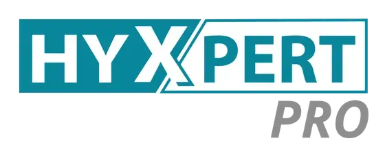
One construction principle for every level: the master brand mark stays unchanged, and only the typographically subordinate descriptor line varies. Each level therefore remains attached to the master brand instead of becoming a brand of its own — the precondition for a tiered offer to be read as one offer.
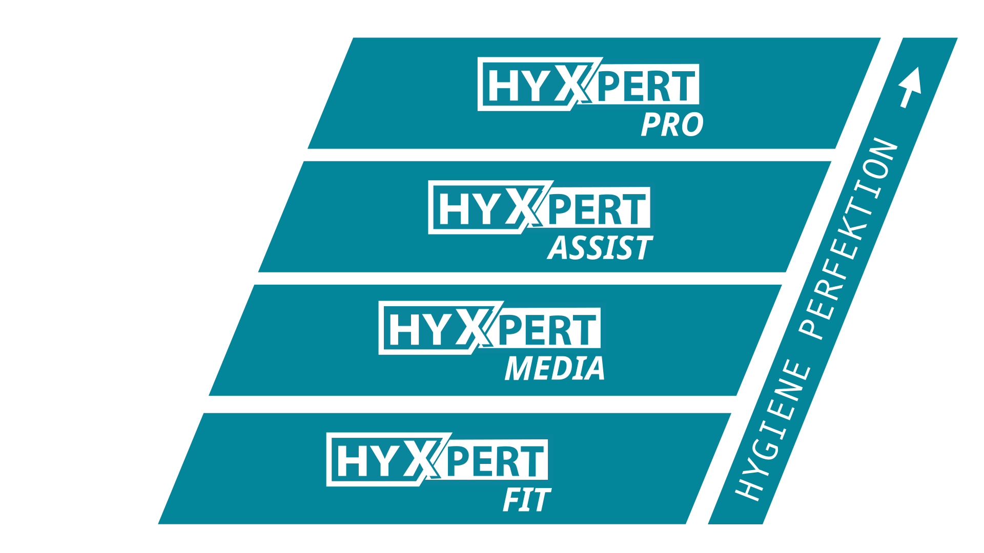
The same order once more, as a scheme: whoever has booked the base level can see what the next one adds. That is what a brand architecture is practically for — it makes an offer legible before it is explained.
Automotive Supplier

Financial Services

Construction Industry

Retail Technology / POS Systems

Automotive Supplier
Professional Sport

Workwear and Safety Equipment
Let's talk. The first conversation is free and without obligation.